Cutting the Perfect Slice - Best Practices for Pie Chart Visualization
Posted on: Oct 11, 2023
Table of Contents
- Introduction
- History and Origin
- When to Use Pie Charts
- The Pros
- The Potential Pitfalls
- Tips for Effective Pie Chart Visualization
- Conclusion
Introduction
In the domain of data visualization, pie charts have established themselves as a fundamental tool for representing categorical data. Known for their circular design where each slice represents a portion of a whole, pie have been a go-to-choice for displaying simple data structures and part-to-whole relationships. However, they come with their set of limitations that may impact the effectiveness of data communication.
History and Origin
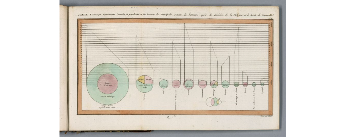
The invention of pie charts dates back to the early 19th century, credited to William Playfair, a Scottish engineer and political economist. Playfair was not just the inventor of pie charts, but a pioneering figure in the field of statistical graphics. His innovative mind led to the development of various types of graphical representation of data, including the line graph and bar chart.
William Playfair’s work was driven by the idea of creating visual representations that could help in simplifying complex quantitative information for a broader audience. His goal was to make complex data easily digestible for a wide audience. His 1786 work, “The Commercial and Political Atlas,” laid the groundwork in data visualization with its use of time-series graphs. However, it was in his 1801 publication, “Statistical Breviary,” that he first introduced the pie chart, along with other innovative graphical formats.
Playfair’s pie charts revolutionized the way data was presented, offering a visually pleasing and proportionate method for displaying categorical data. Their simplicity and effectiveness have ensured their continued popularity.
When to Use Pie Charts
Pie charts are well-suited for scenarios that require the portrayal of percentage or proportional data, where each slice contributes to a total sum. They excel in situations where the emphasis is on comparing the parts to the whole, such as market share, election results, or budget allocations. Specifically, pie charts excel at:
Simple Data Structures:
- Pie charts work best when the number of categories is limited. Typically, having fewer categories (around 2 to 5) helps in maintaining clarity and effectiveness in communication.
Good
Bad
Comparative Analysis:
- When the goal is to compare the proportion of categories to a whole, pie charts can be quite effective. They visually represent the share each category holds, making it easier for the audience to grasp the relative proportions.
Highlighting Individual Categories:
- Pie charts allow for the emphasis on individual or specific categories by using distinct colors or by detaching slices from the main chart. This helps in drawing attention to certain segments of data that may hold more significance or require special mention.
The Pros
The primary advantages of pie charts include their simplicity and visual clarity. They offer a clear distinction between categories, and their color-coded slices facilitate easy comprehension at a glance, making them a favorable choice for straightforward data representation. One of their strongest traits, is the ability to highlight a part-to-whole relationship, which allows instant gauging of the share of each category.
Moreover, pie charts shine when presenting data with a limited number of categories. They eliminate unnecessary clutter and present the information in a concise manner, ensuring the data’s message remains the focal point.
The Potential Pitfalls
Despite their advantages, pie charts possess certain limitations:
- Precision: Determining minor differences in slice sizes can be challenging, especially with an increased number of categories. For example, consider a pie chart showing competing brands in a specific industry. If the market shares are slight, a viewer will have a hard time discerning the differences and gathering useful information aside from the market is evenly distributed.
- Comparison: Comparing individual sections either within a single pie chart or across multiple pie charts can be difficult. For example, consider two pie charts showcasing the quarterly revenue distribution of a company over two consecutive years. The viewer might struggle to determine whether the revenue for a specific quarter was higher or lower in the second year just by looking at the slices.
Year 1
Year 2
- Data Capacity: Pie charts can become cluttered or unreadable with too many categories, limiting their utility for complex data sets. For example, if you were to create a pie chart that represents a breakdown of the most spoken languages in the world (condensed to the top 20), it would become too cluttered. The numerous small slices for languages with fewer speakers would be hard to differentiate, and labels might overlap, making the chart unreadable.
Tips for Effective Pie Chart Visualization
To enhance the effectiveness of pie charts, consider the following tips:
- Limit Slices: Keep the number of slices to a minimum to ensure clarity.
- Avoid 3D: 3D pie charts can distort perception and misrepresent data.
- Clear Labeling: Ensure each slice is clearly labeled to facilitate understanding.
Conclusion
Pie charts can serve as a valuable tool for data visualization when used appropriately. Understanding when and how to use them, along with being aware of their limitations, is crucial for effective data communication. Remember that your choice of chart, whether it be a pie, bar, or line, can make or break your narrative. Your primary aim should always be clarity and precision, ensuring your audience walks away with a clear understanding of the data insights you aim to share.
If you found this blog post helpful, consider sharing it with a colleague or friend. If you have any questions, thoughts, or comments please don’t hesitate to reach out!